Same starting point,
different every time.
Design systems don't fail because of bad components. They fail because of bad fit — the wrong approach for the wrong context. Each of these three situations demanded a different entry point, different pace, different political strategy.
The token layer is what all three systems have in common. Not the color values themselves — those changed completely across products — but the discipline of naming, agreeing, and documenting them before touching a single component.
Collaboration with dev
as the starting point.
The systems worked because the developers were involved from the beginning — not consulted after the fact. Across all three products, the design/dev relationship followed the same three practices, adapted to each context.
Before any component was touched, I sat with the lead developer to agree on token names. Not design names, not engineering names — shared names that would mean the same thing in Figma and in the Tailwind config. This single session prevented weeks of "which blue is that?" conversations downstream.
Weekly or bi-weekly sessions where a developer and I would go through components in progress — not for sign-off, but for early friction detection. The goal was balance: making sure a component was actually usable before it reached production, not theoretically perfect on a Figma canvas. Catching an implementation problem at design stage costs a conversation. Catching it in QA costs a sprint.
Every token defined in Figma had a direct counterpart in the Tailwind config — same name, same value, same hierarchy. The design file and the codebase described the same system. No translation layer, no "close enough." When a component referenced color-action, both sides knew exactly what that meant.
This wasn't a process imposed on the dev team. It was built with them. The token naming sessions in particular created a sense of shared ownership — the system wasn't something handed over for implementation, it was something we'd both agreed to.
Mixup — Building a system
where none existed.
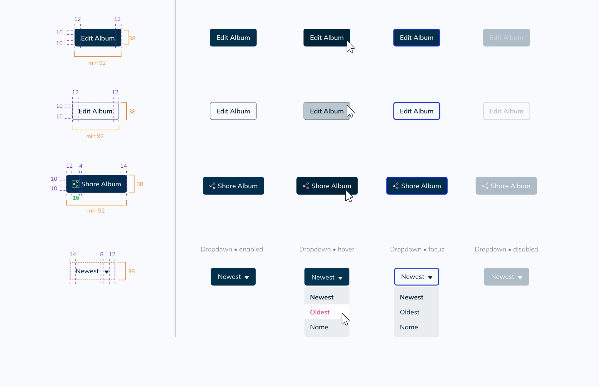
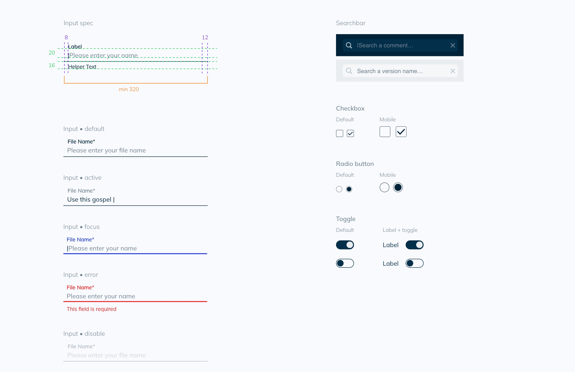
Mixup was my first design system. The developers were competent and fast — they'd shipped a working product without a designer. That was the problem: they didn't feel the absence of a design system because they'd never had one.
The first job wasn't designing components. It was earning the right to introduce process into a team that had built a product without it. I started on real features — not a design system backlog — so the value was visible within the first sprint.
The challenge
Outcome
- Devs could rely on design documentation for the first time
- Consistent visual language from day one
- Same token language between design and code
- New features built faster as the component library grew
What I learned
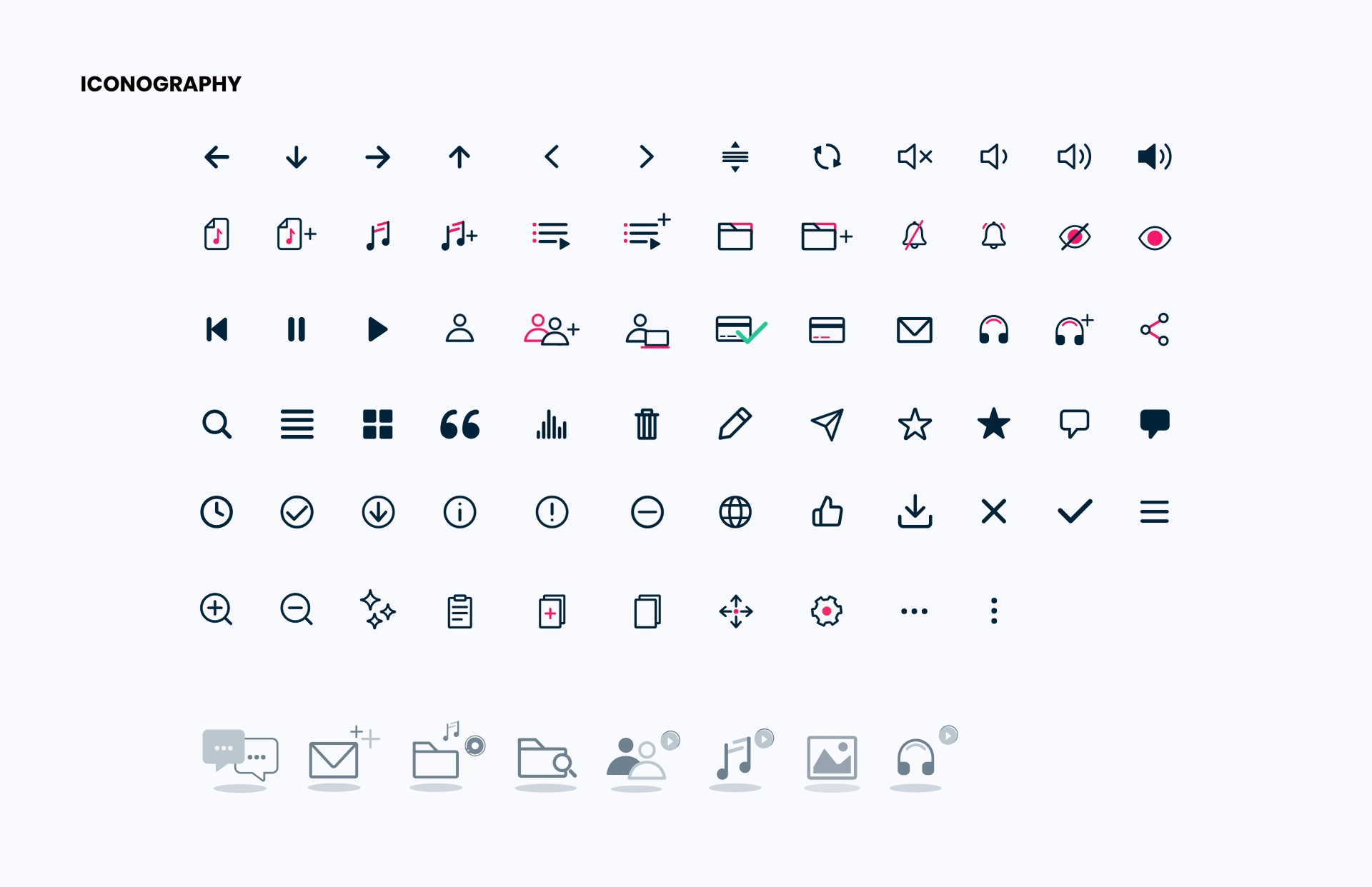
Mixup had a very specific visual identity, so I designed the icons myself. I'm proud of that work — being the first designer on the team meant owning everything, and the result was coherent. But looking back, a solid icon library would have freed up significant time to focus on harder product problems. Custom iconography is a real cost; it's worth asking whether it's the right one.
Designing across iOS, Windows, web app, mobile, and audio plugins forced me to understand what "consistent" actually means when the rendering environment changes completely. QA sessions across platforms were some of the most valuable design education I've had.
Puremix — Rebuilding when
patching is too slow.
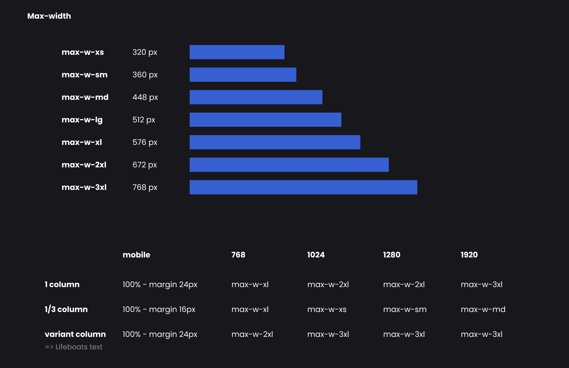
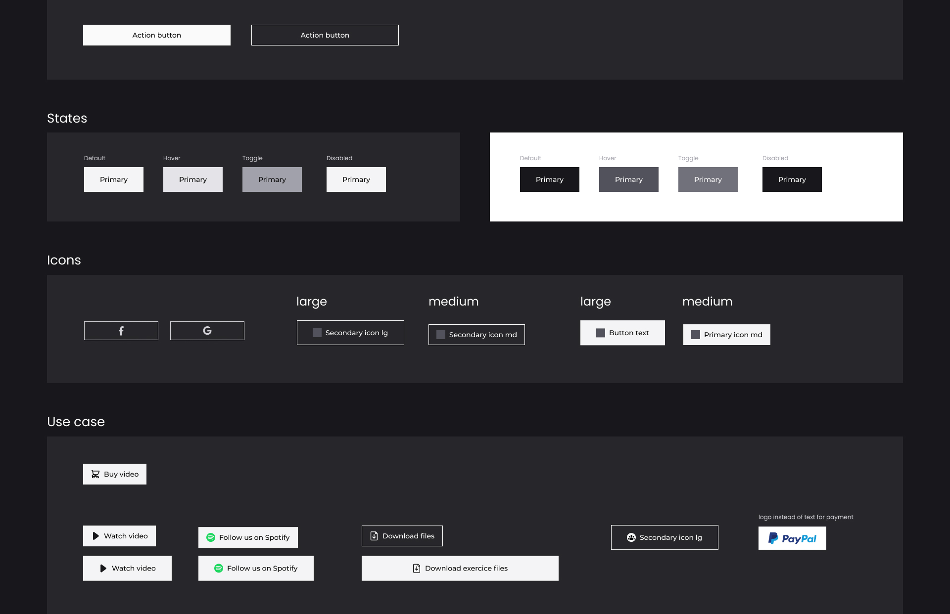
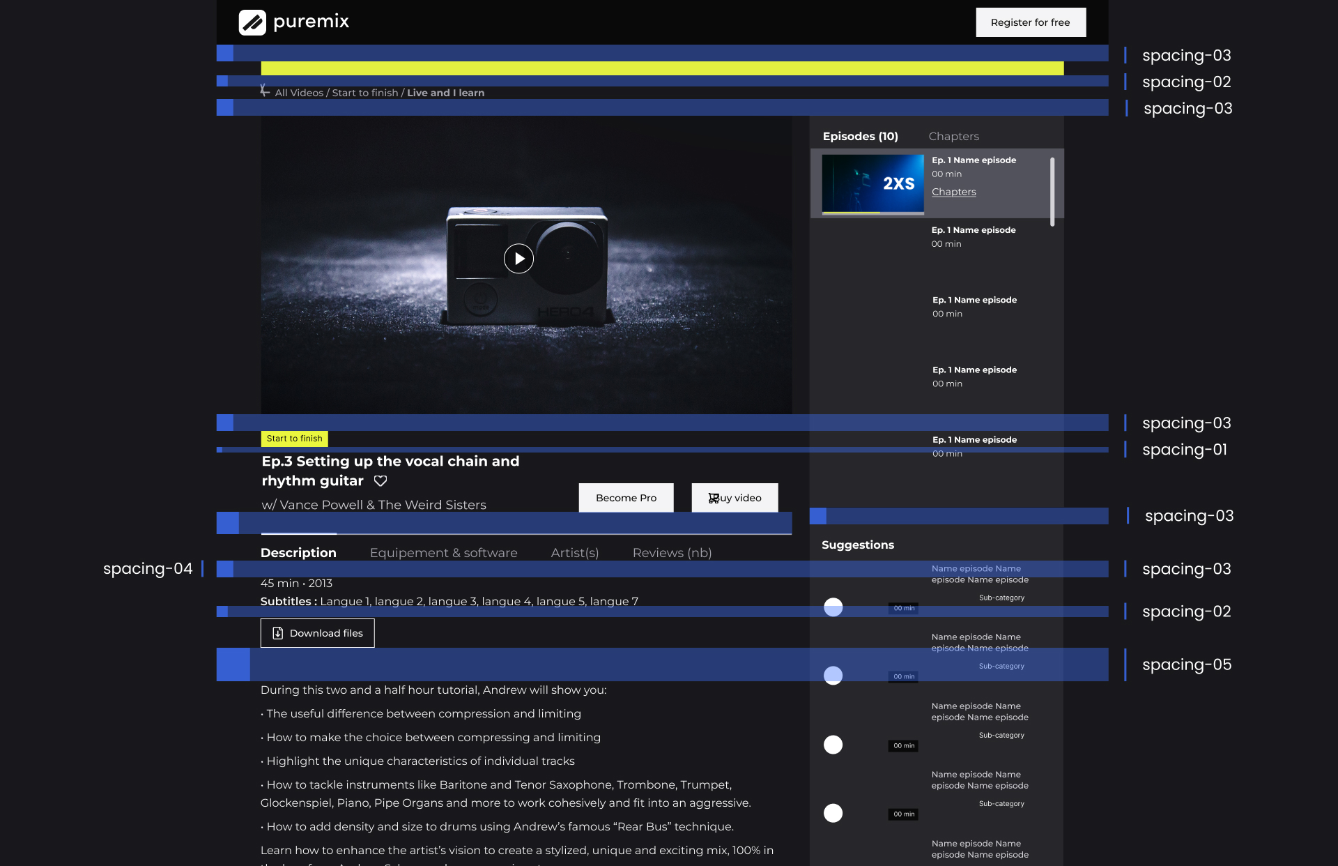
Puremix is a large audio education platform — video courses, instructor profiles, subscription tiers. The codebase had accumulated years of inconsistency: styles duplicated across pages, components with the same name but different behavior, spacing that varied by a few pixels with no reason.
The debt wasn't cosmetic. It ran through the architecture. Any change to a shared component created unpredictable side effects. The team had stopped touching certain parts of the codebase entirely. Patching would have been slower and riskier than rebuilding.
Working without a safety net
There was no dedicated design system team. Verification happened in pre-prod and post-prod — not in design reviews. I was simultaneously building the system and mentoring student designers who were helping with QA. More coverage, but also more coordination overhead.
At the time, tooling didn't support native token management. The process was explicit by necessity — tokens documented manually, Tailwind config written to match exactly. That discipline forced better conversations between design and dev than any tool would have.
"For the first time, what shipped looked like what was designed. Not approximately — exactly."
— Feedback from dev lead during first QA pass with the new system
Outcome
- First complete design/code alignment in the product's history
- Fewer "that's not what I designed" moments in QA
- New pages assembled from existing components rather than designed from scratch
- Student designers trained on real product work
Spacefill — Migrating without
stopping the product.
Spacefill is a B2B logistics SaaS — warehouse management, stock tracking, carrier coordination. The product was live, actively developed, and running on a design library that had been abandoned. Components were inconsistent, undocumented, and often reimplemented from scratch by different developers.
The hard constraint: the product couldn't stop shipping. There was no migration window, no freeze. Every sprint added new features while we were trying to replace the foundation underneath them.
migration process
Color primitives → semantic tokens, spacing scale, typography. Nothing visible to users yet, but the design/code contract was now in place. No component was touched until this layer was agreed on.
Buttons, inputs, badges, tables, modals. All built on the new token system. The old components stayed in production until their page was migrated — no regression risk.
Stock, Orders, Transportation, Carriers... Each sprint, one page. All components on that page replaced with the new system. No big bang, no feature freeze, no parallel branches.
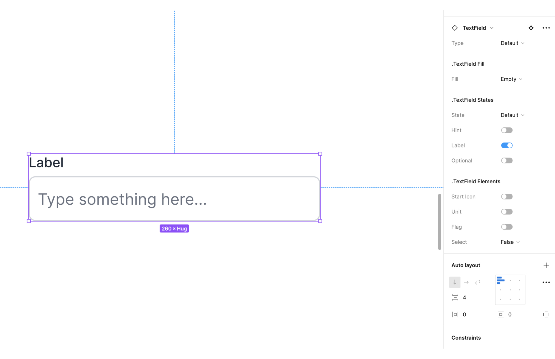
Spacefill's logistics domain has very specific needs — multi-unit input forms, hierarchical stock tables, address selectors, carrier assignment flows. The system needed clear extension rules: when to create a new component, how to name it, how to keep it coherent with the base layer without forking the design language.
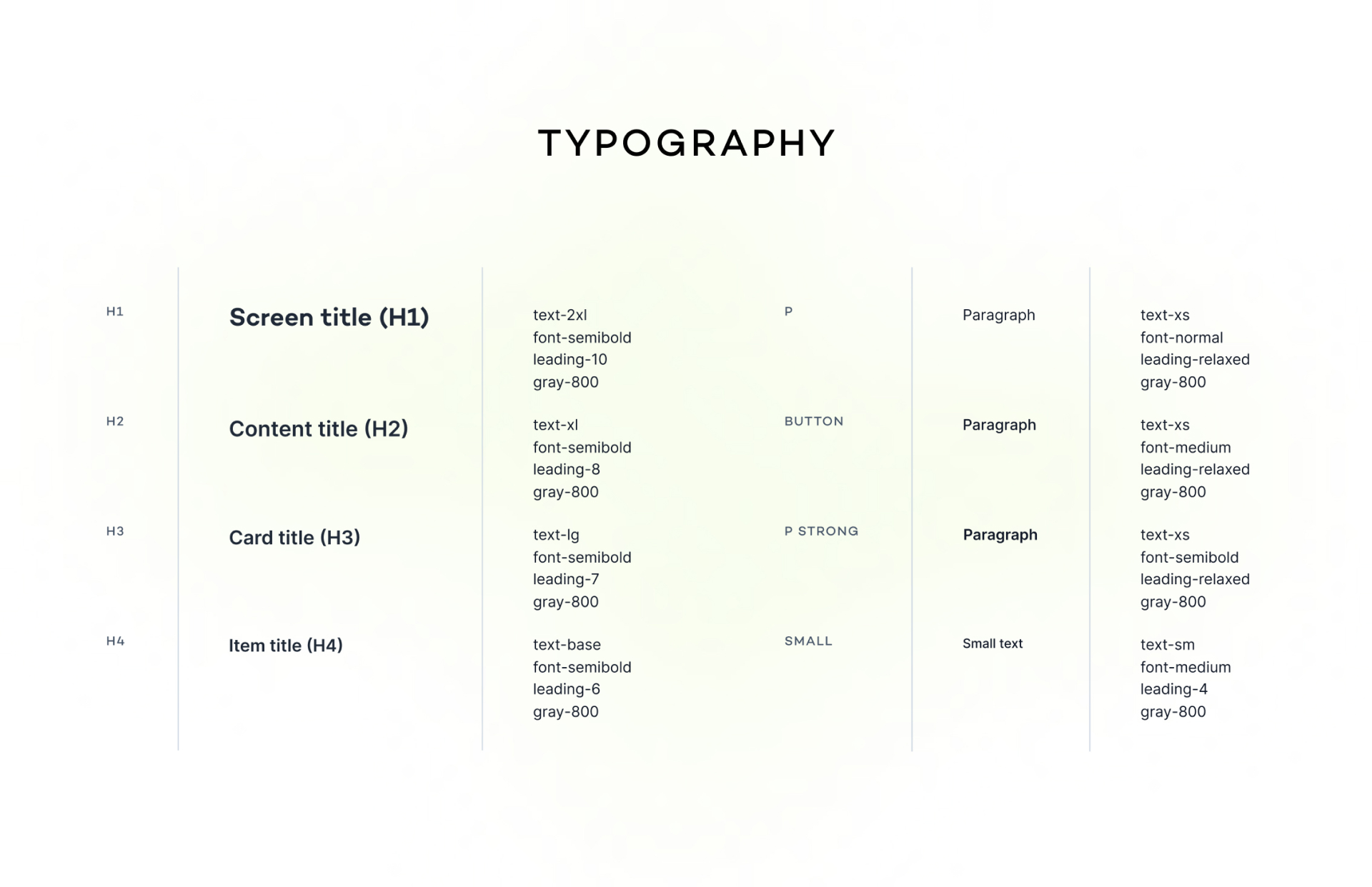
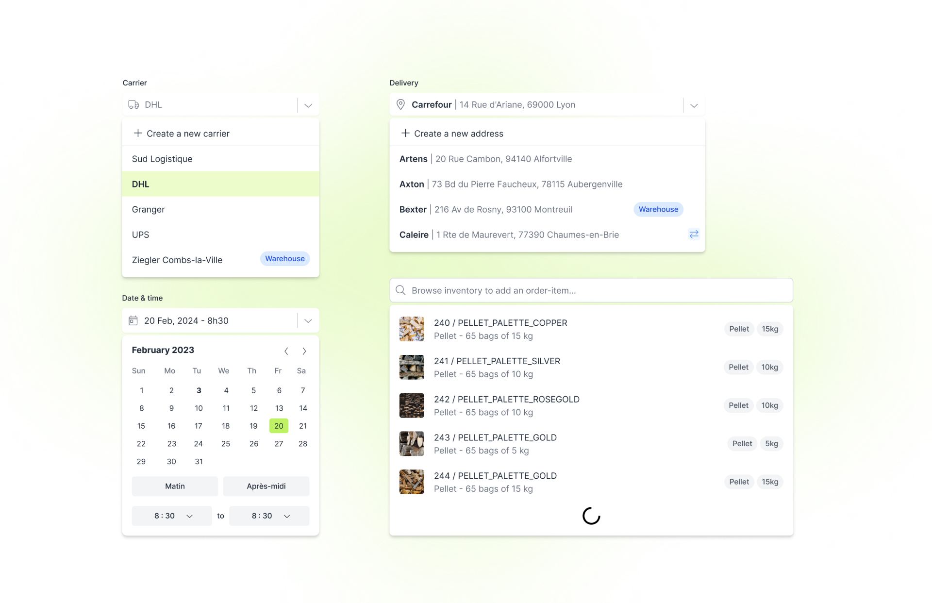
"The goal wasn't to replace everything. It was to make sure that whatever existed — old or new — felt like it belonged to the same product."
Outcome
- Outdated library fully replaced without service interruption
- New features built faster on a stable, maintained foundation
- Visual consistency restored across all pages
- Logistics-specific components documented and reusable across the team
Takeaways
A blank page, a fragile codebase, and a live product require completely different strategies. The discipline is the same. The approach can't be.
The token layer is the cheapest thing to get right early and the most expensive to fix late. Every component you build before agreeing on tokens is a component you'll eventually rebuild.
Components don't ship themselves. Proving value on real features, involving developers from the start, and building extension rules alongside the base system — that's what makes a system last.